
MyFonts
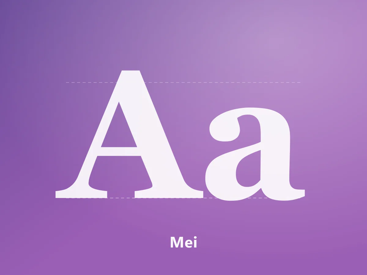
Mei
A high-contrast serif family uniting Chinese characters and Latin letterforms in an editorial voice.
200 USDView Product
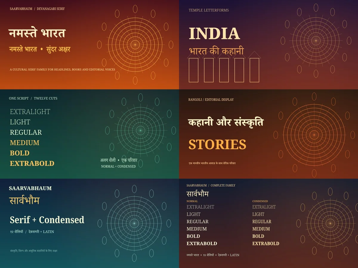
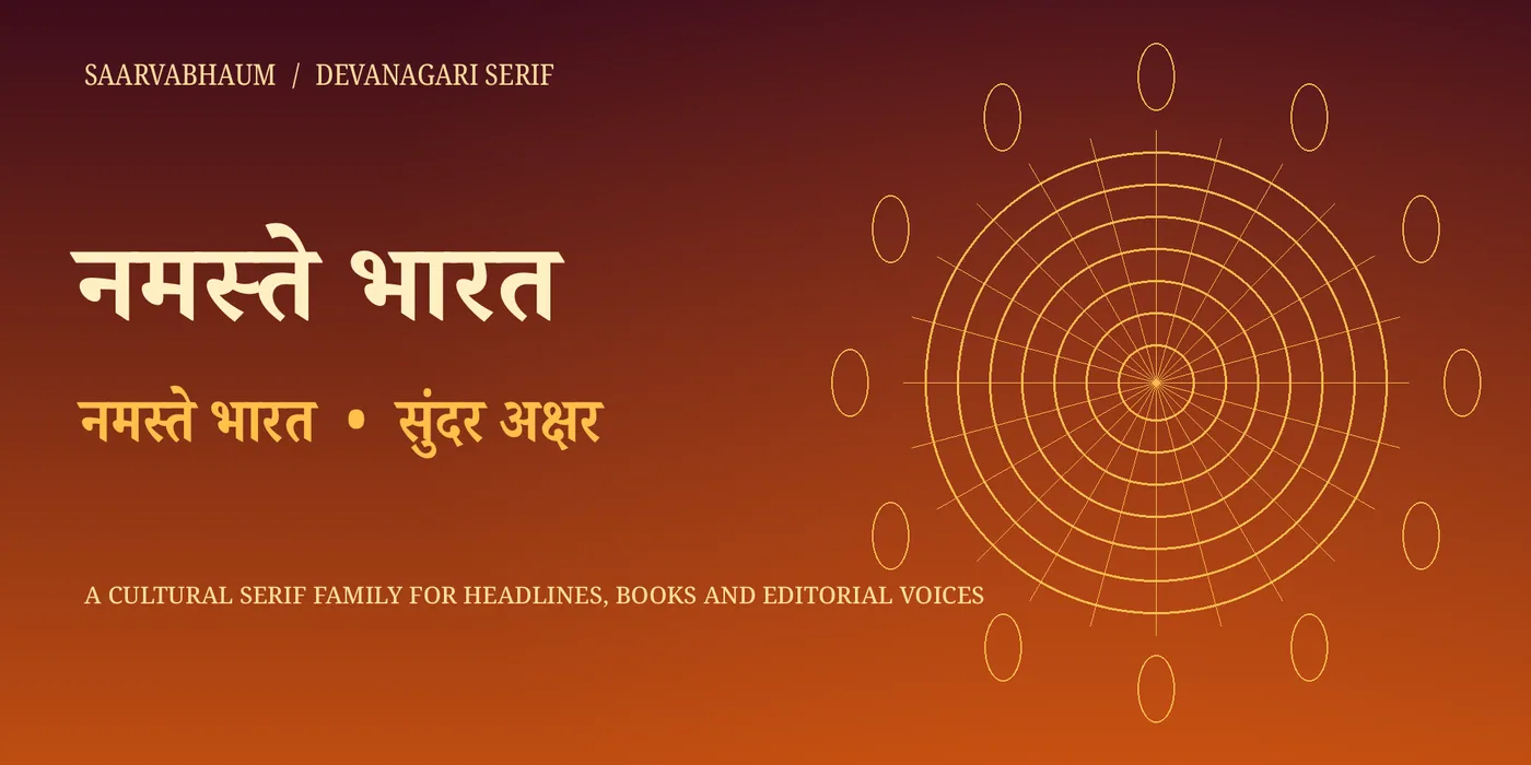
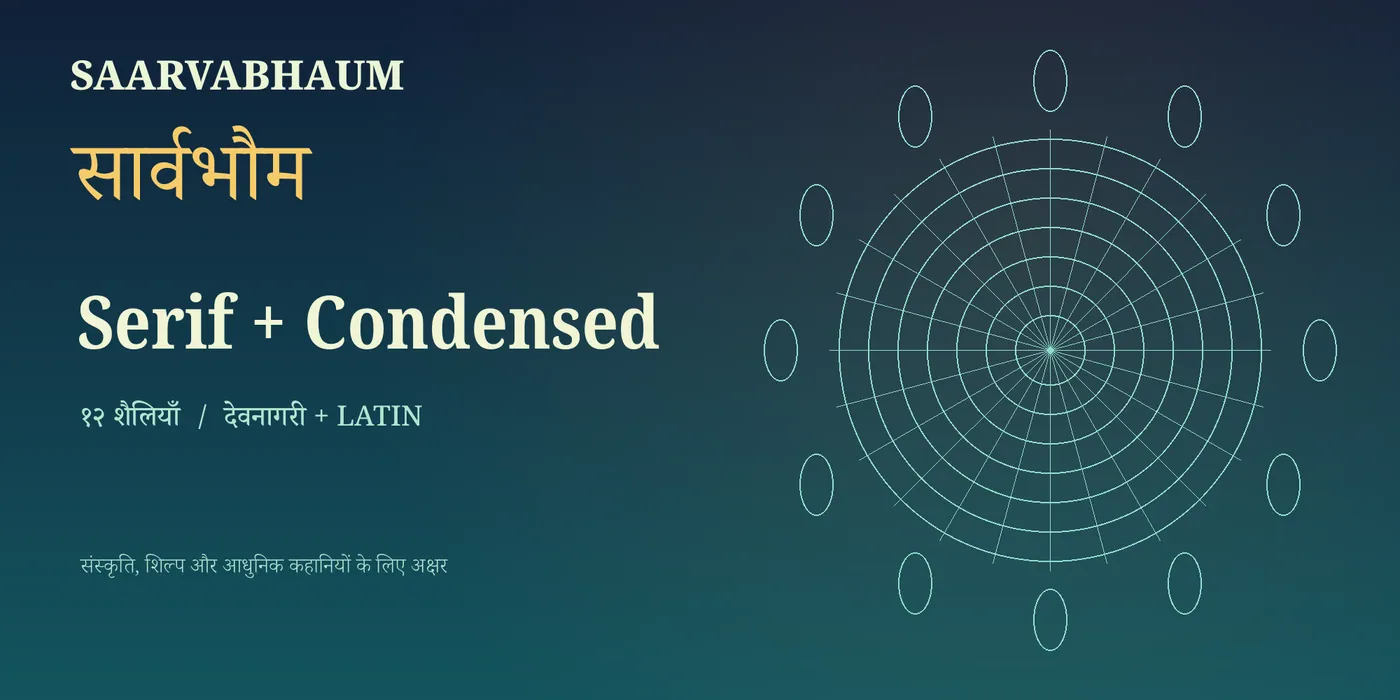
A Devanagari serif family. Twelve cuts across normal and condensed widths.
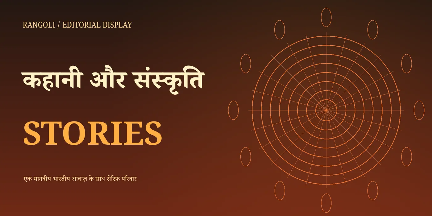
Saarvabhaum is a serif family prepared for the Devanagari script. It combines traditional letter structure with a contemporary approach to serifs and stays legible in long-form text.
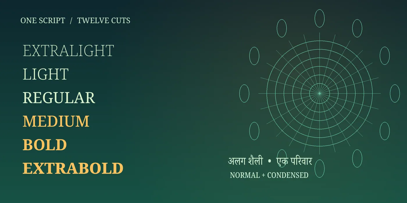
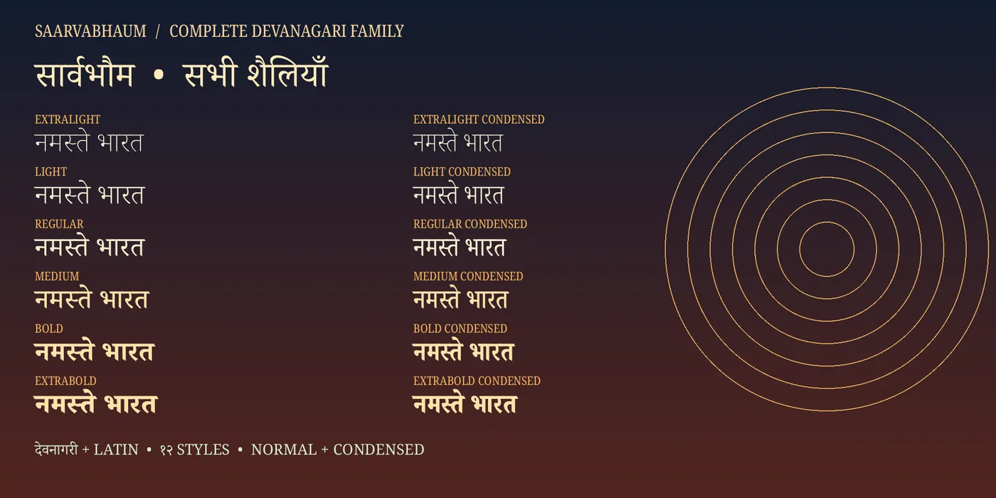
The family includes twelve cuts across two widths. The normal width offers ExtraLight, Light, Regular, Medium, Bold and ExtraBold; the same six weights are available in a narrower body under the name Saarvabhaum Condensed. A variable version carrying both weight and width axes is also available.
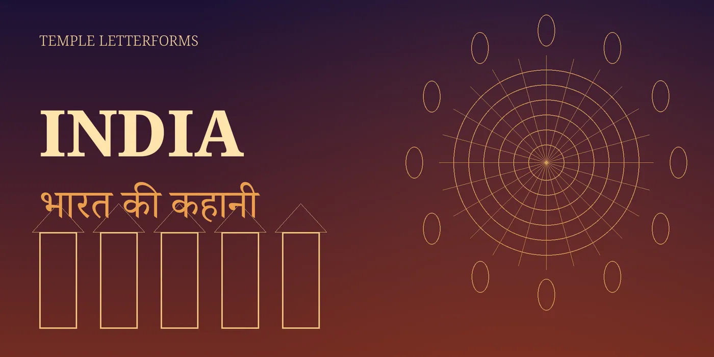
It suits cultural publications, festival and ceremonial posters, book design, packaging and brand identities.
MyFonts
A high-contrast serif family uniting Chinese characters and Latin letterforms in an editorial voice.
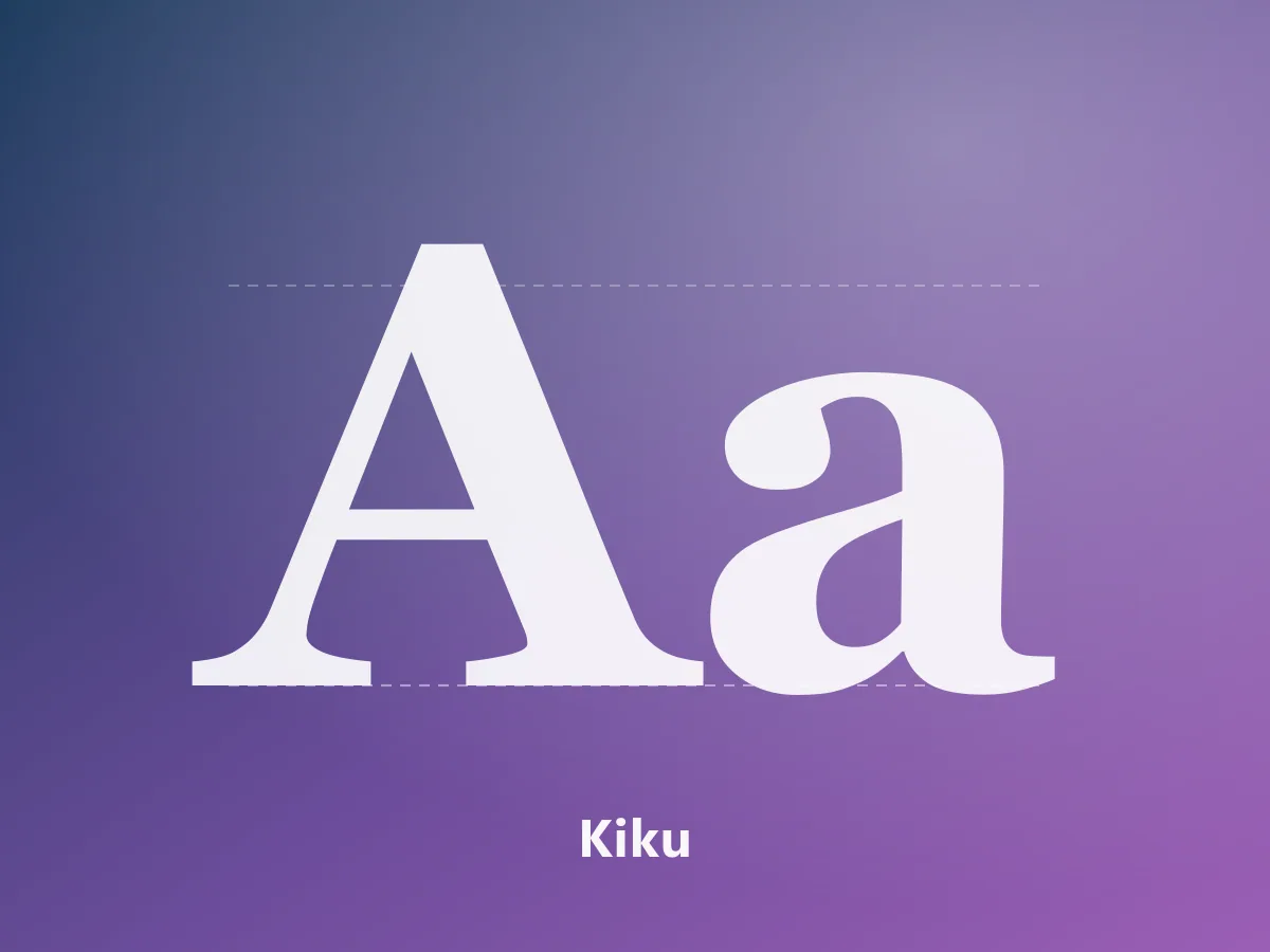 Featured
MyFonts
An elegant serif family with editorial character, bringing Japanese and Latin letterforms together.
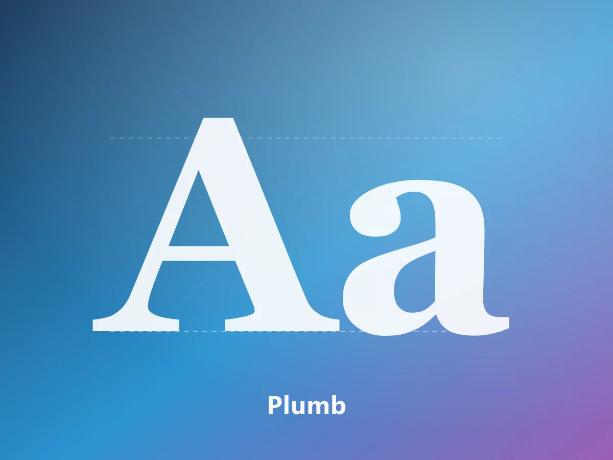 Featured
MyFonts
A 28-style contemporary neo-grotesk. A complete typographic system for branding, editorial design and interfaces.