
 Featured
MyFonts
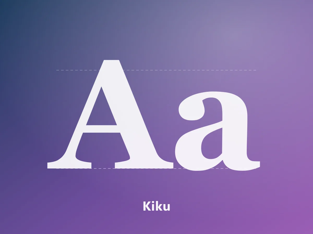
Kiku
An elegant serif family with editorial character, bringing Japanese and Latin letterforms together.
250 USDView Product
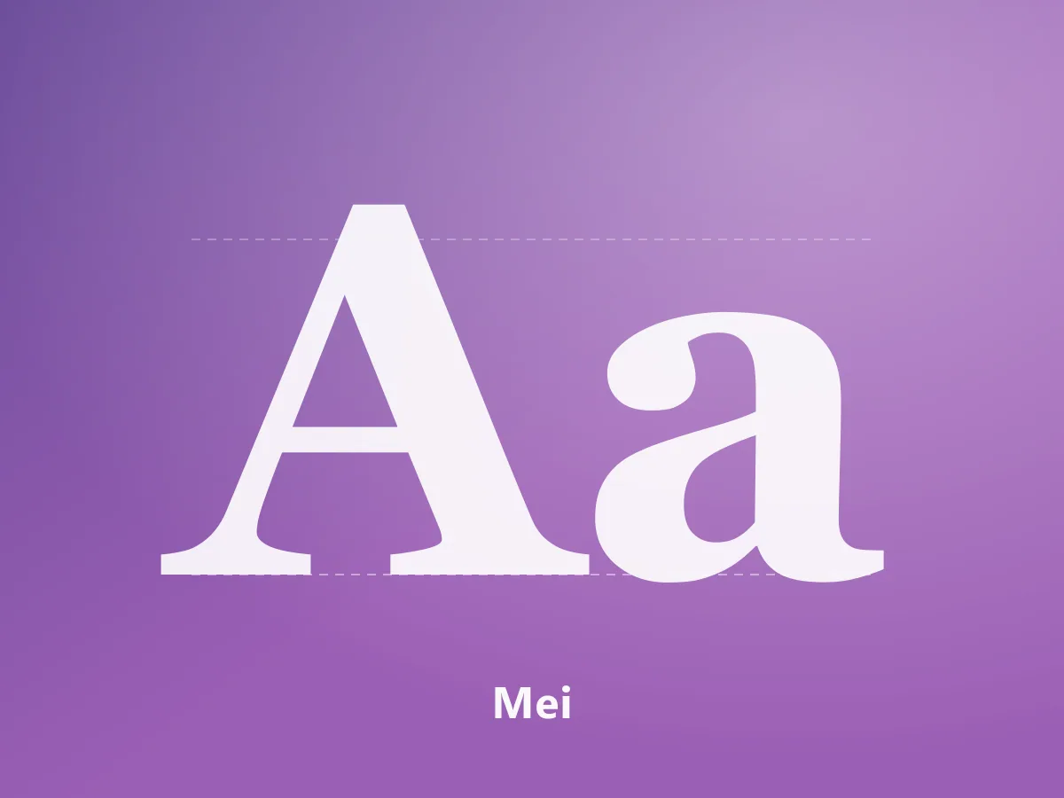
A high-contrast serif family uniting Chinese characters and Latin letterforms in an editorial voice.
200 USD
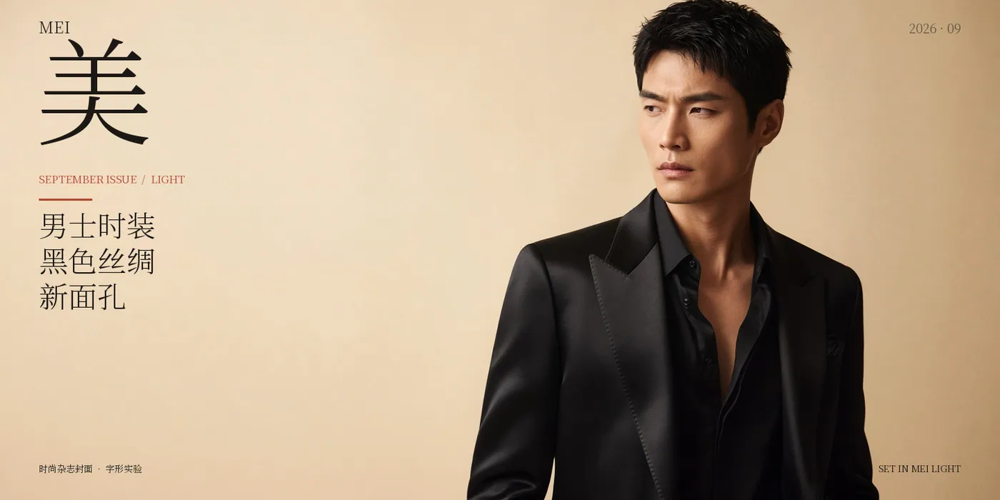
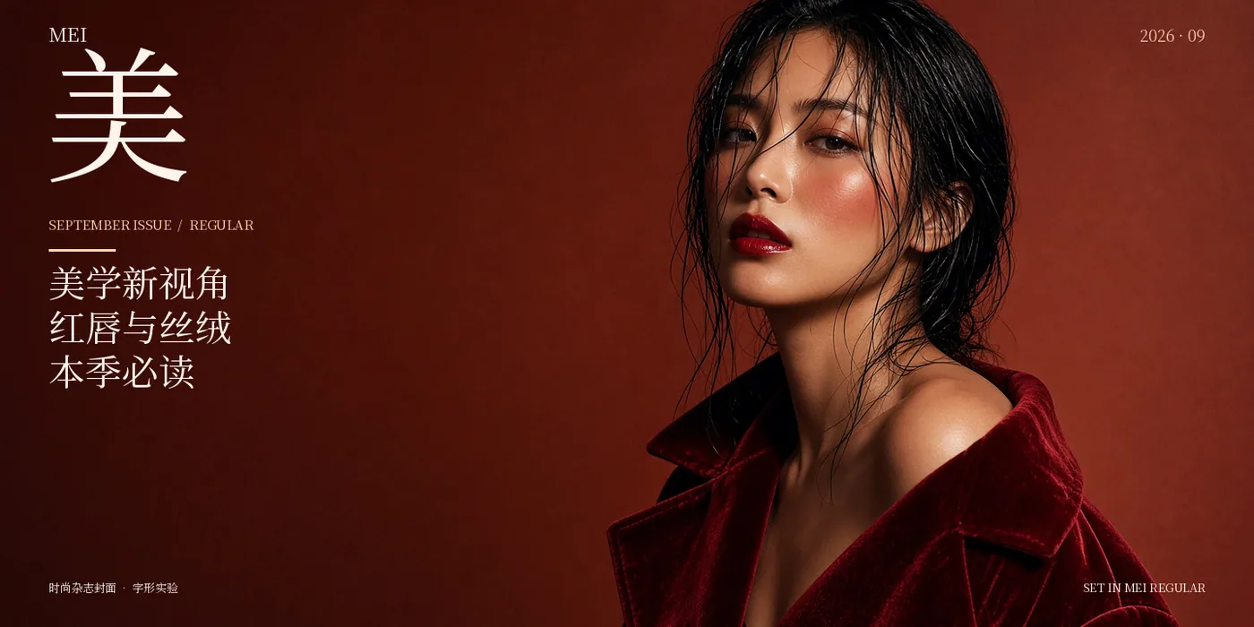
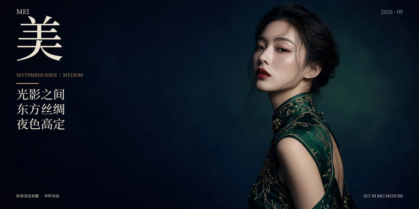
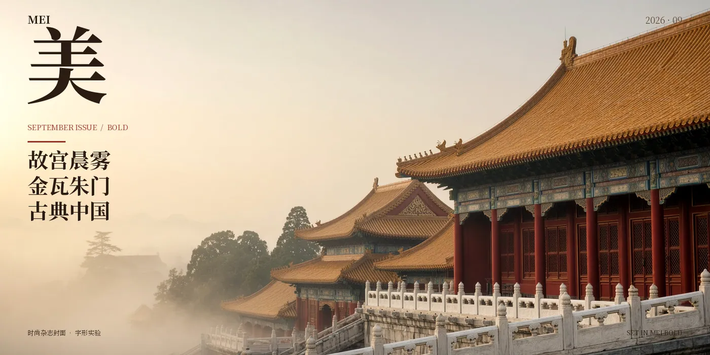
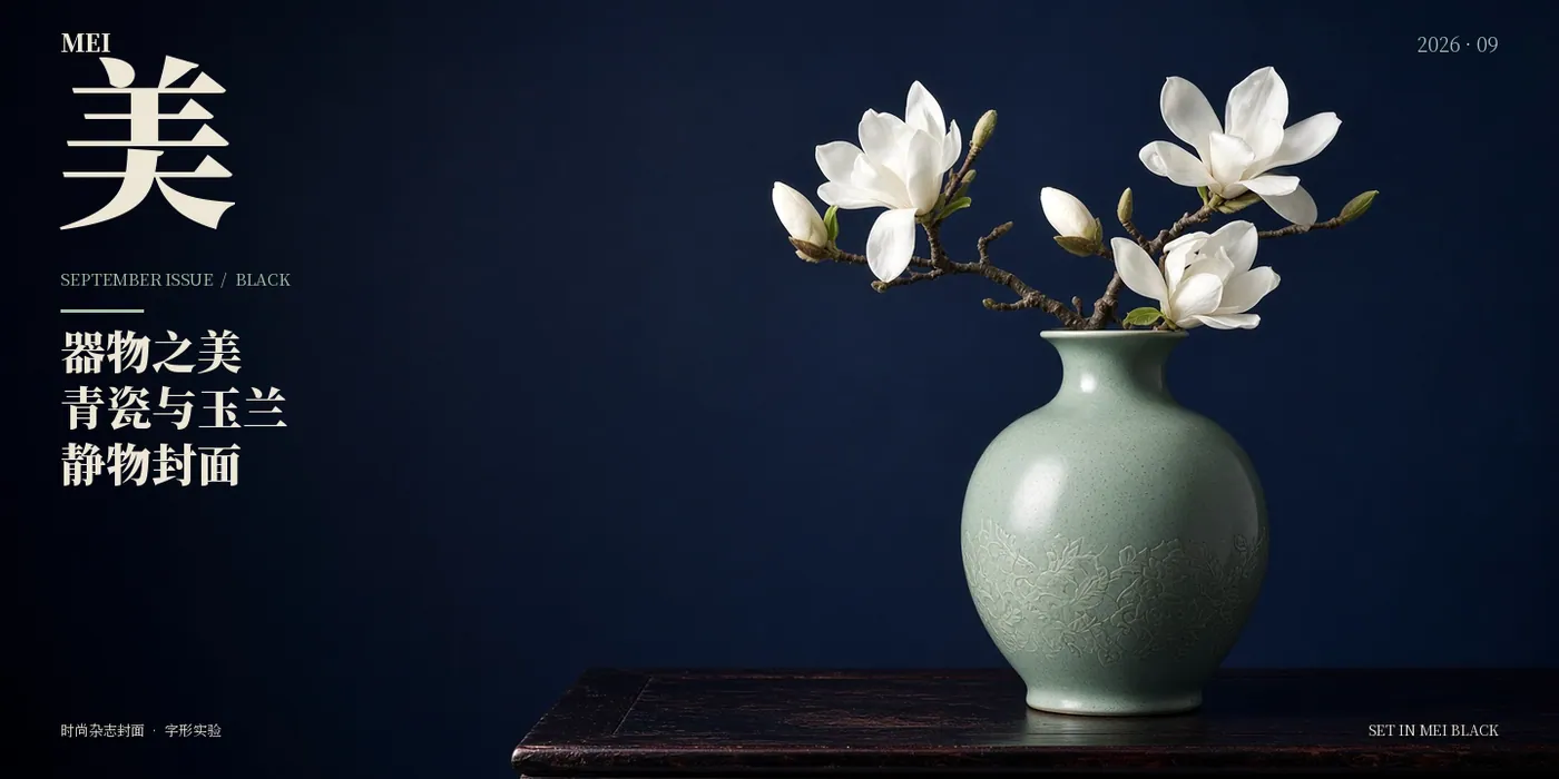
Mei is a serif typeface family that brings Chinese characters and Latin letterforms together in an expressive editorial style. Contrasting strokes and carefully shaped details give its character forms a distinctive presence in magazine covers, cultural publications, posters and packaging.
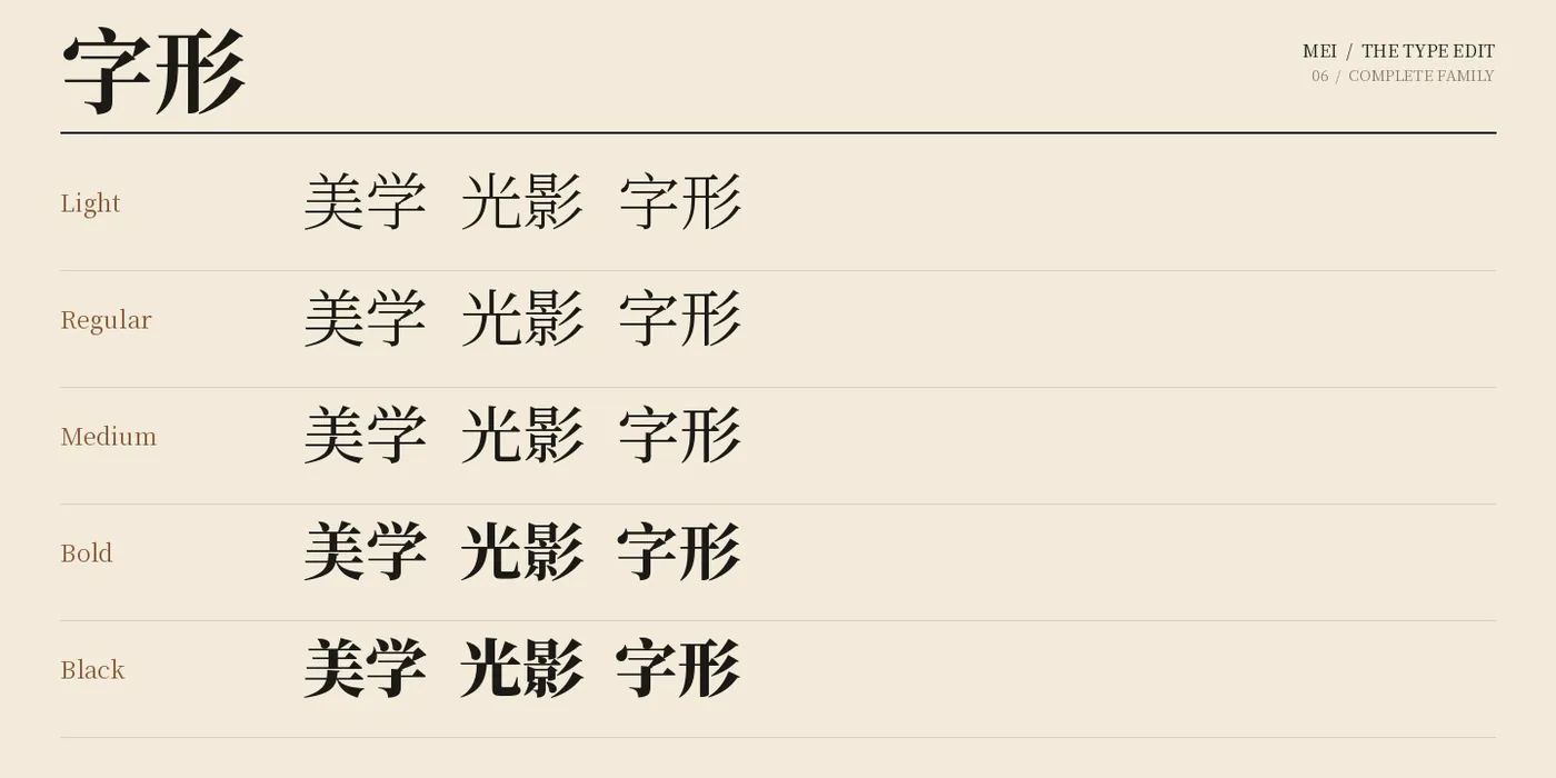
The family includes five weights: Light, Regular, Medium, Bold and Black. Light offers a delicate voice for spacious compositions, while Bold and Black bring emphasis to prominent headlines. Regular and Medium provide a balanced middle ground.
Mei's Chinese character forms take centre stage in oversized typography, while its Latin letters support bilingual layouts. Combine contrasting weights, generous space and large characters to create striking typographic compositions.
 Featured
MyFonts
An elegant serif family with editorial character, bringing Japanese and Latin letterforms together.
 Featured
MyFonts
A 28-style contemporary neo-grotesk. A complete typographic system for branding, editorial design and interfaces.
 Featured
MyFonts
A contemporary sans serif with open forms and clean lines. 14 styles from Light to Black with italics.