
MyFonts
Mei
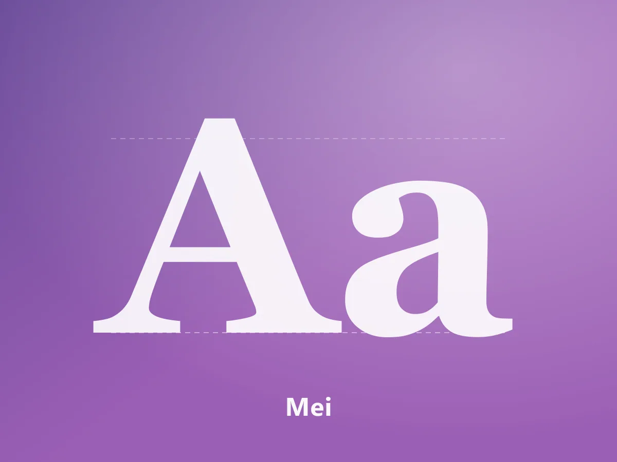
A high-contrast serif family uniting Chinese characters and Latin letterforms in an editorial voice.
200 USDView Product
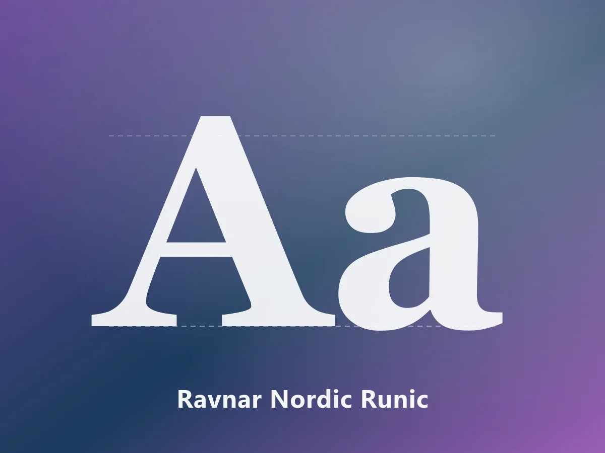
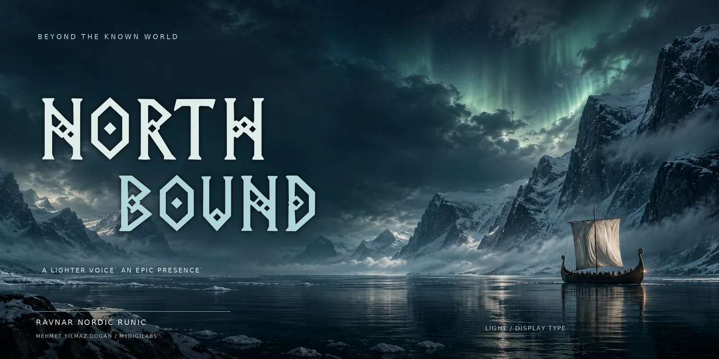
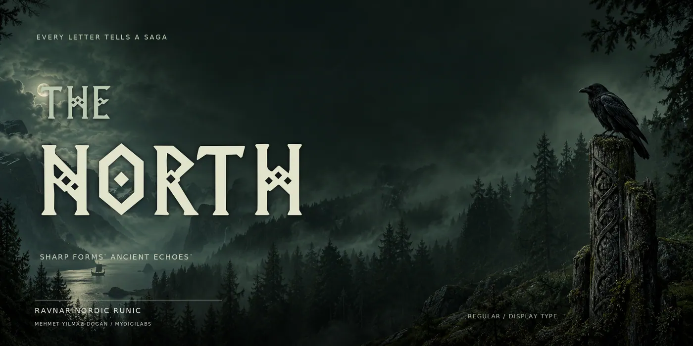
A decorative display family with pointed terminals and diamond ornaments, inspired by Nordic lettering.
17 USD
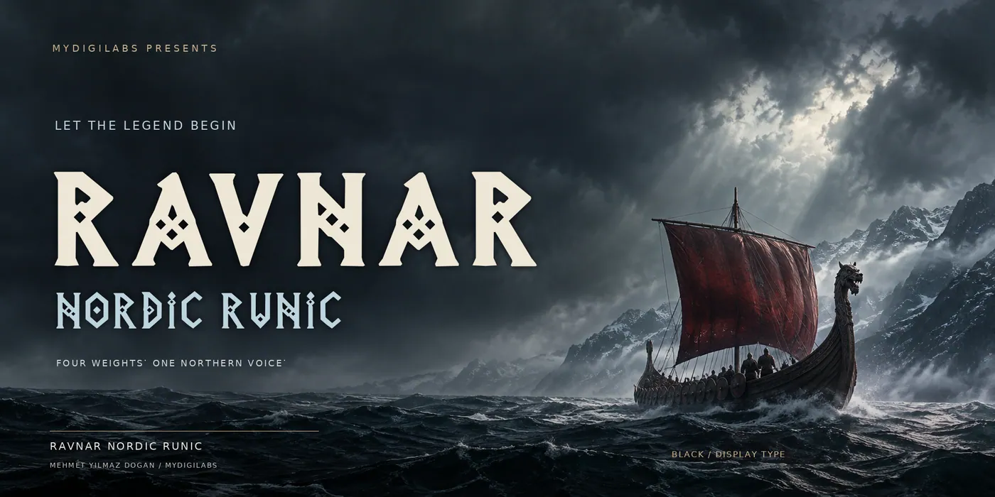
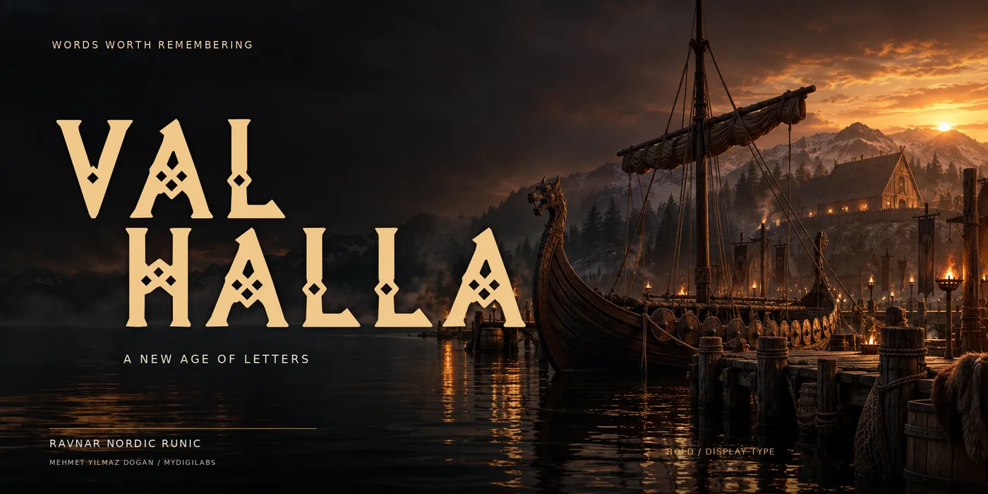
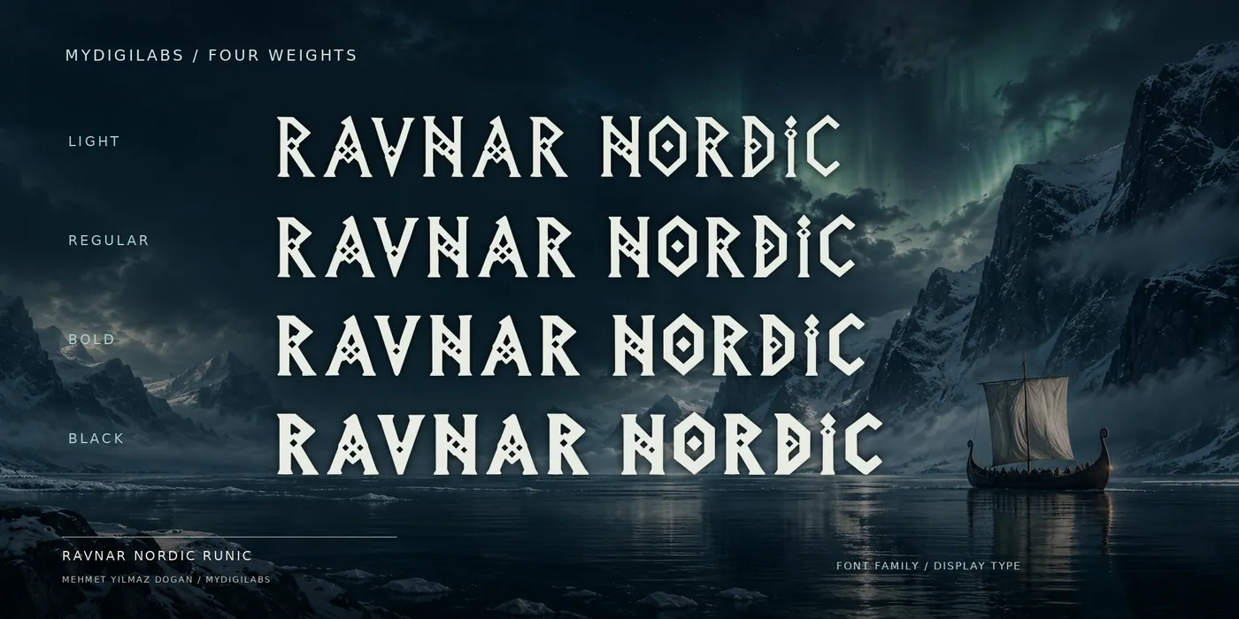
Ravnar Nordic Runic is a decorative display family inspired by the angular rhythm of Nordic lettering. Pointed terminals, sculpted silhouettes and diamond-shaped ornaments give its Latin letterforms a strong identity for cinematic titles, fantasy artwork, game branding, book covers and expressive logos.
Four weights — Light, Regular, Bold and Black — offer different voices within the same visual language. Use Light for atmospheric titles, Regular for distinctive headlines, Bold for dramatic compositions and Black for a commanding focal point.
The family includes uppercase and lowercase Latin letters, numerals and selected punctuation. Its runic inspiration is expressed through Latin letterforms; it does not include a historical Runic Unicode alphabet.
MyFonts
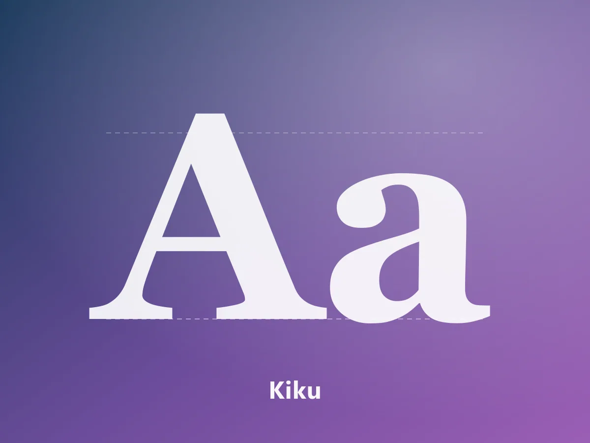
A high-contrast serif family uniting Chinese characters and Latin letterforms in an editorial voice.
 Featured
MyFonts
An elegant serif family with editorial character, bringing Japanese and Latin letterforms together.
 Featured
MyFonts
A 28-style contemporary neo-grotesk. A complete typographic system for branding, editorial design and interfaces.