MyFonts
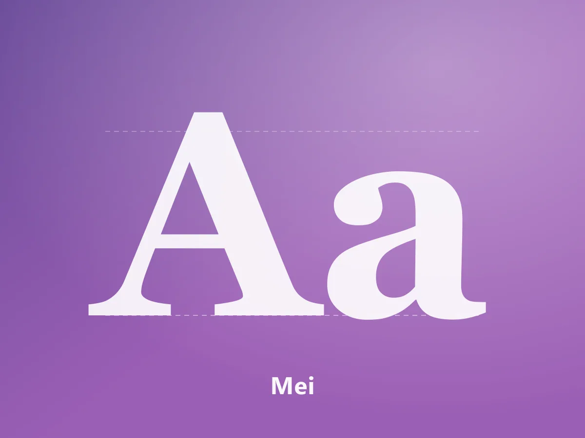
Mei
A high-contrast serif family uniting Chinese characters and Latin letterforms in an editorial voice.
200 USDView Product
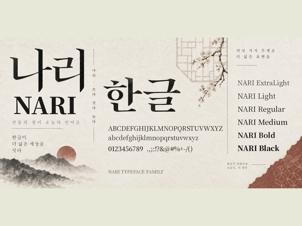
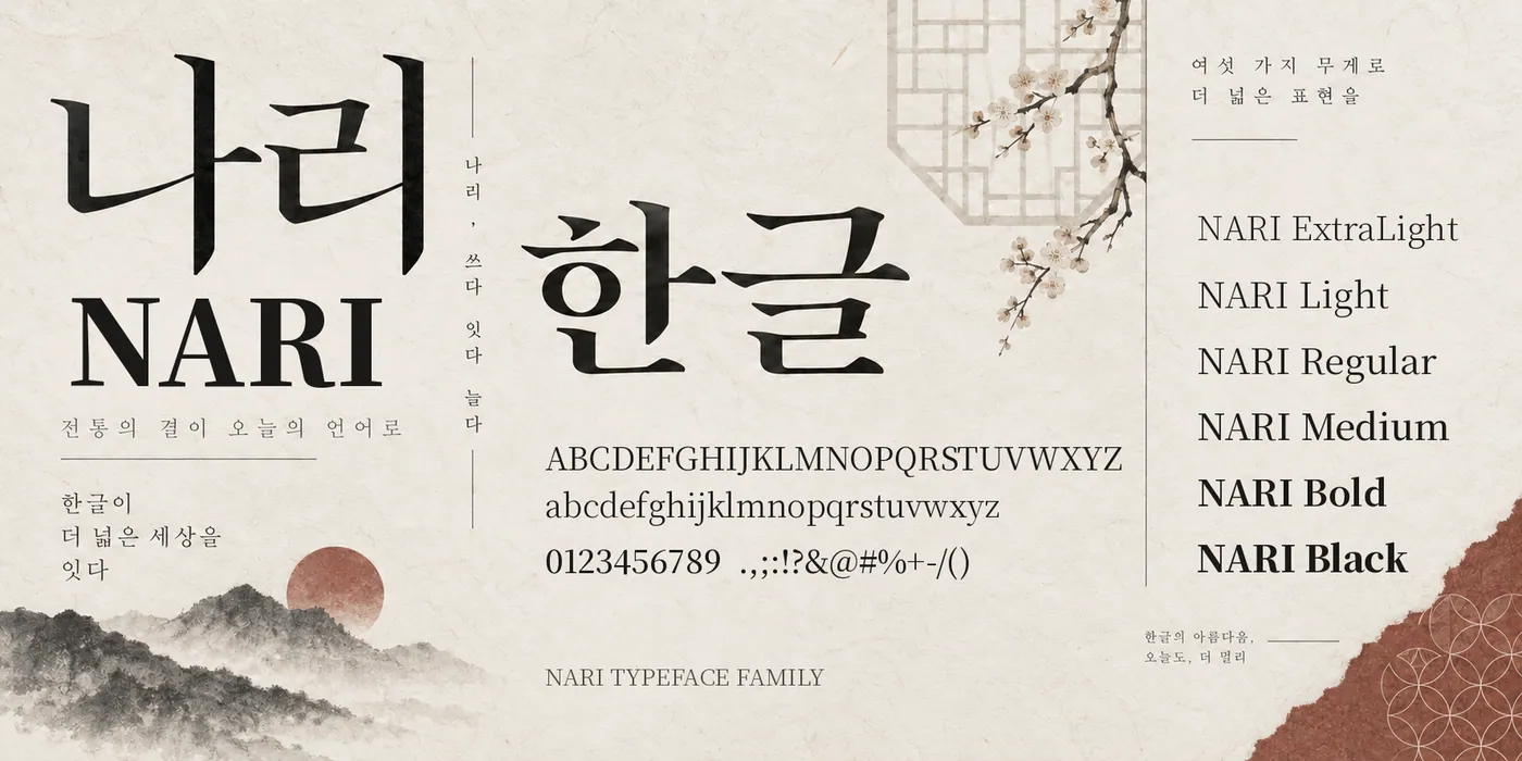
A sans serif family for Korean cultural typography. Six weights plus a variable version.
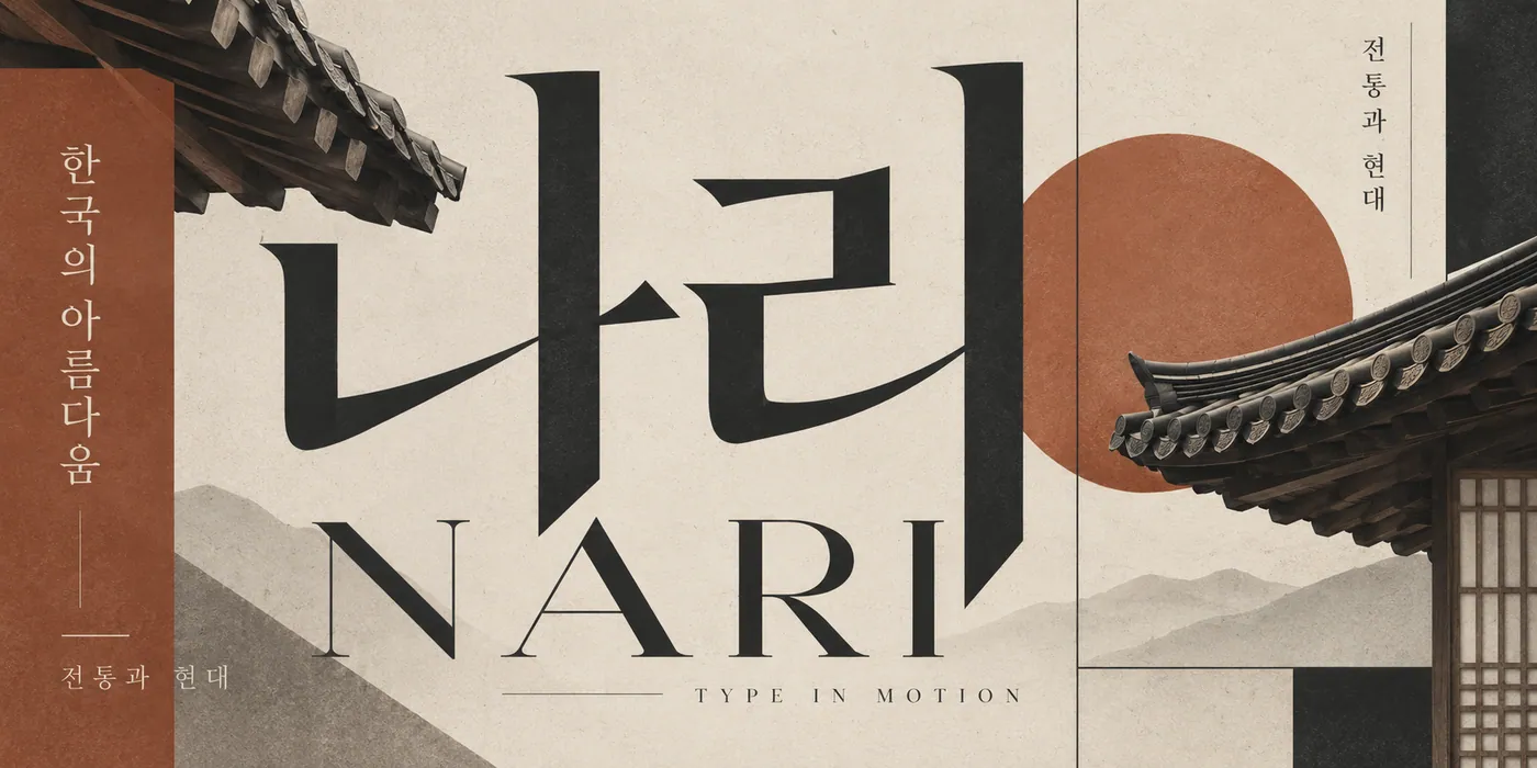
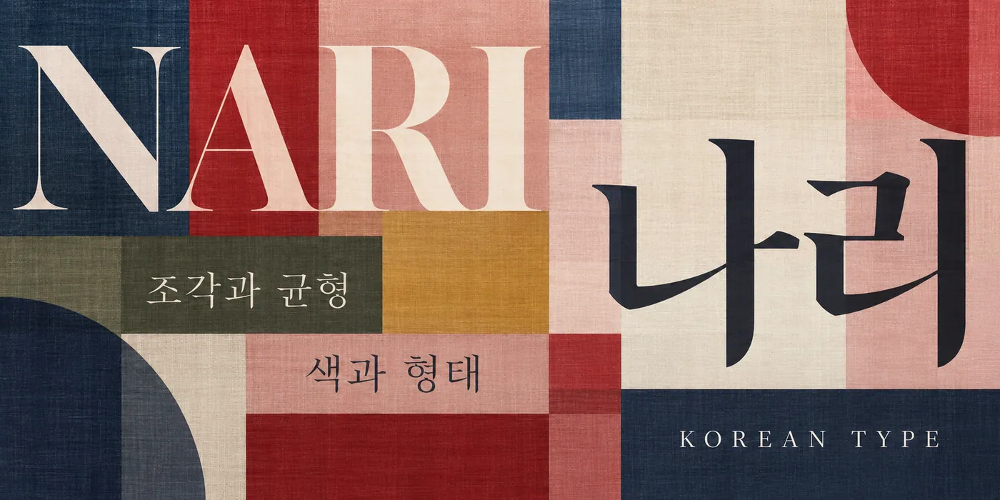
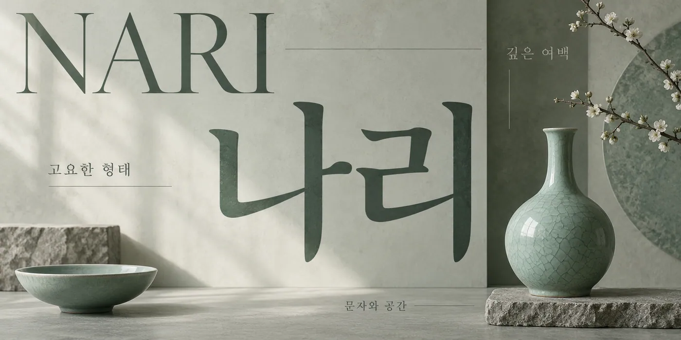
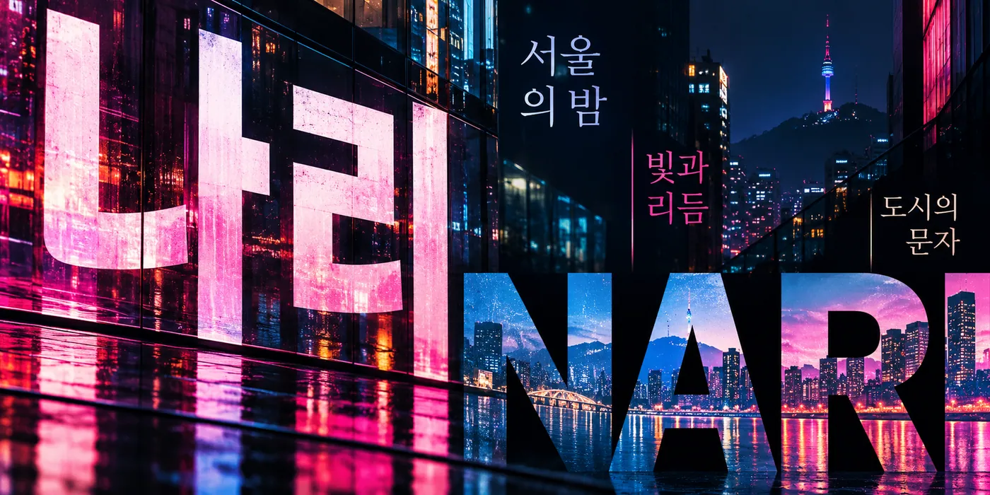
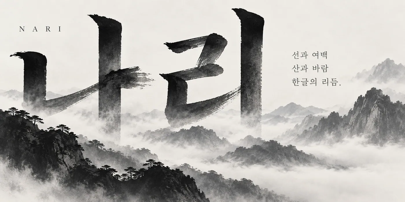
Nari is a sans serif family prepared for Korean cultural content and contemporary editorial design. The balance between Hangul characters and Latin letters keeps bilingual compositions comfortable to read.
The family includes six static weights: ExtraLight, Light, Regular, Medium, Bold and Black, along with a variable version.
It suits exhibition and museum publications, cultural posters, book covers, brand identities and digital publishing.
MyFonts
A high-contrast serif family uniting Chinese characters and Latin letterforms in an editorial voice.
 Featured
MyFonts
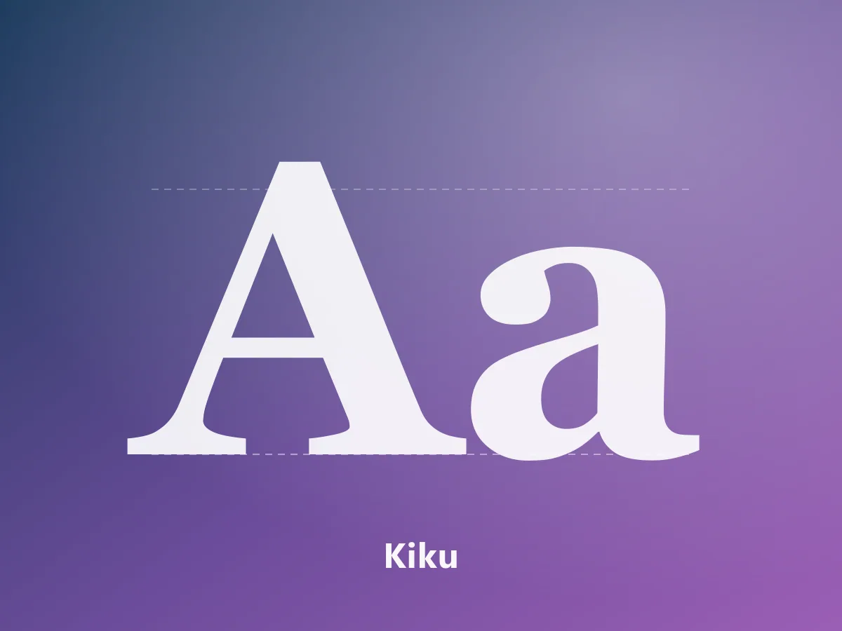
An elegant serif family with editorial character, bringing Japanese and Latin letterforms together.
 Featured
MyFonts
A 28-style contemporary neo-grotesk. A complete typographic system for branding, editorial design and interfaces.