MyFonts
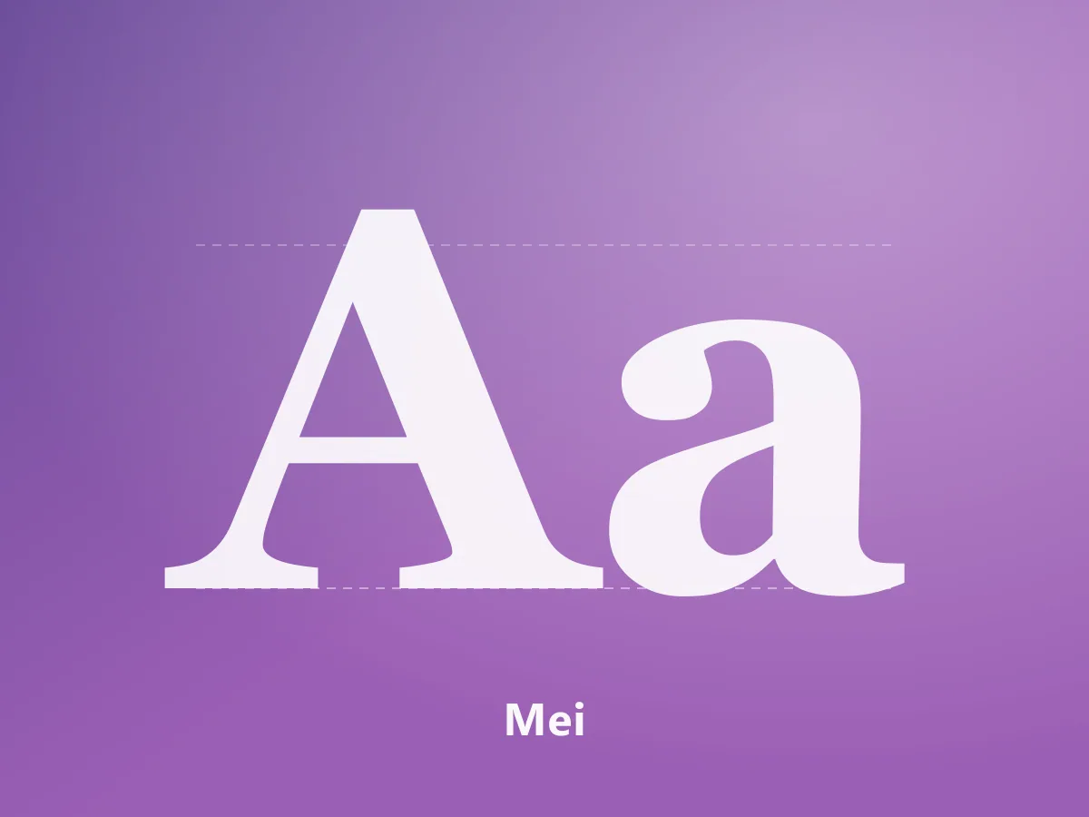
Mei
A high-contrast serif family uniting Chinese characters and Latin letterforms in an editorial voice.
200 USDView Product
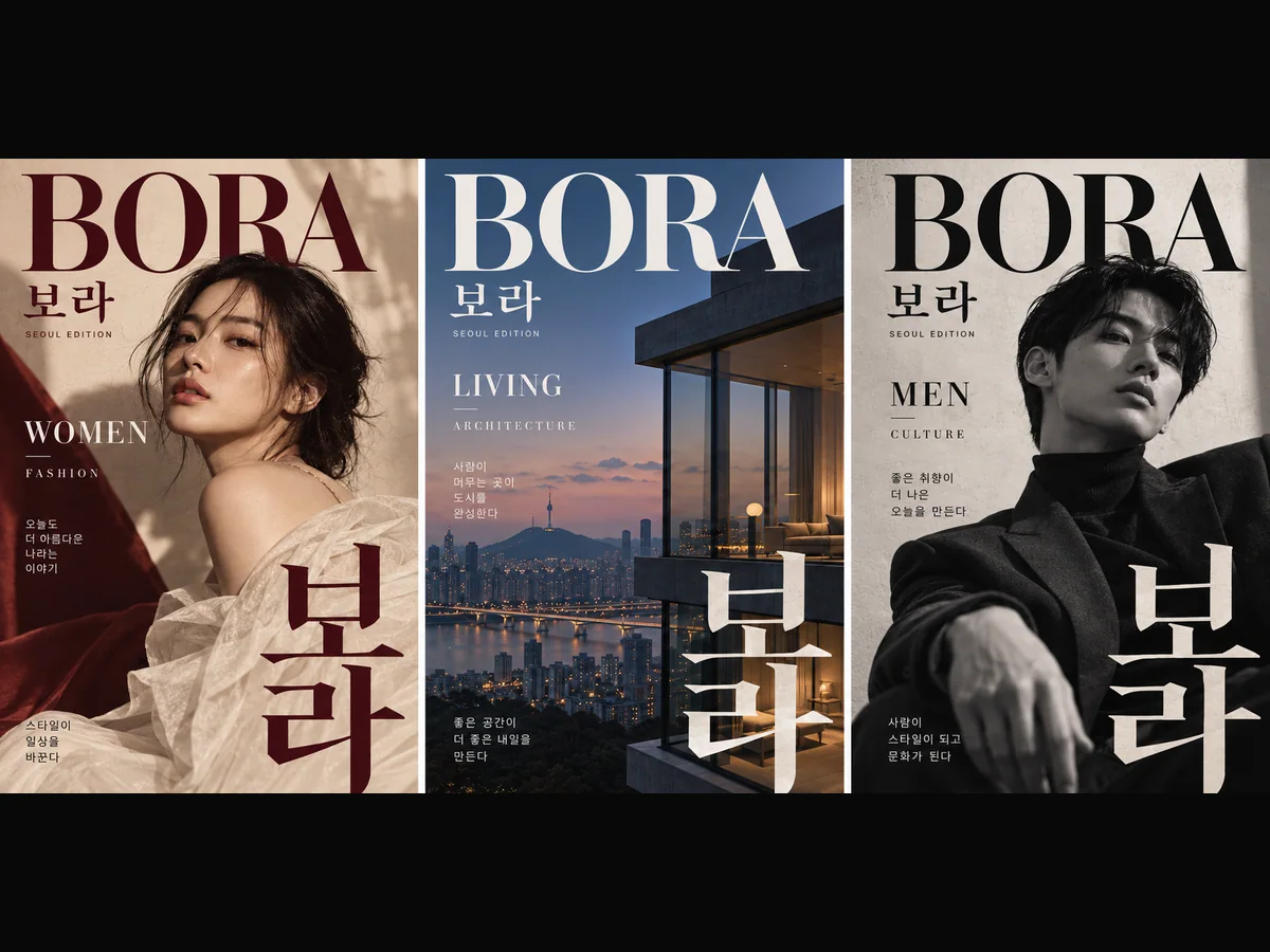
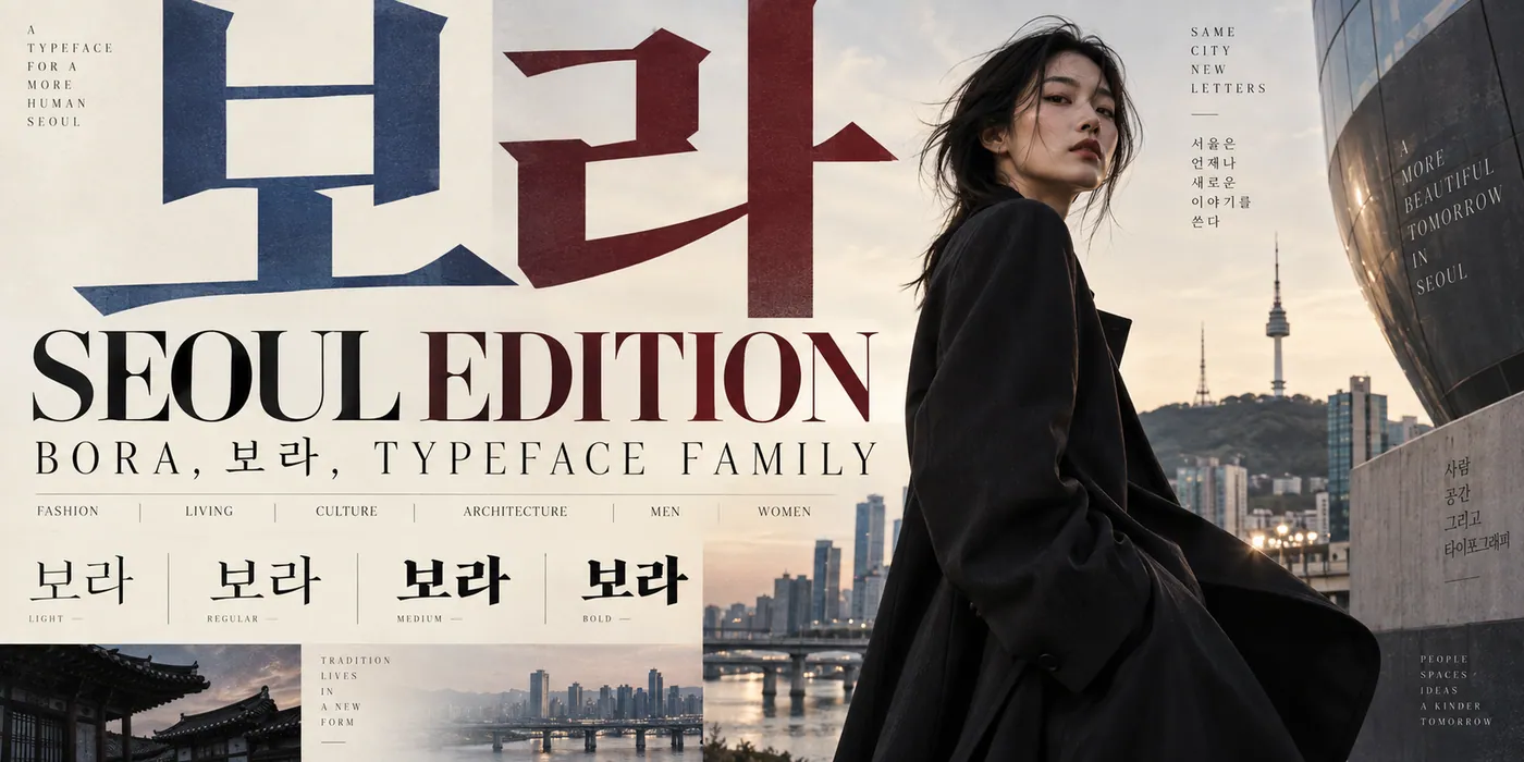
A premium magazine gothic with Korean and Latin support. Seven weights plus a variable version.
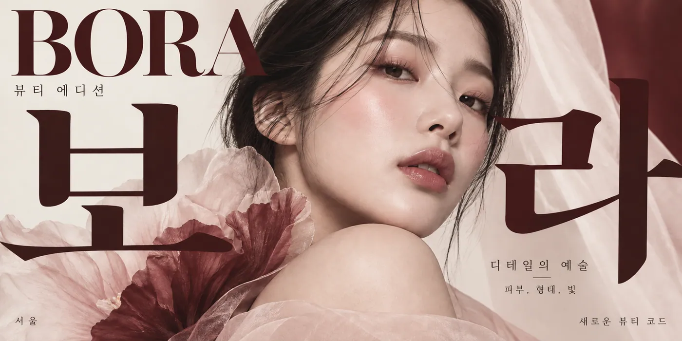
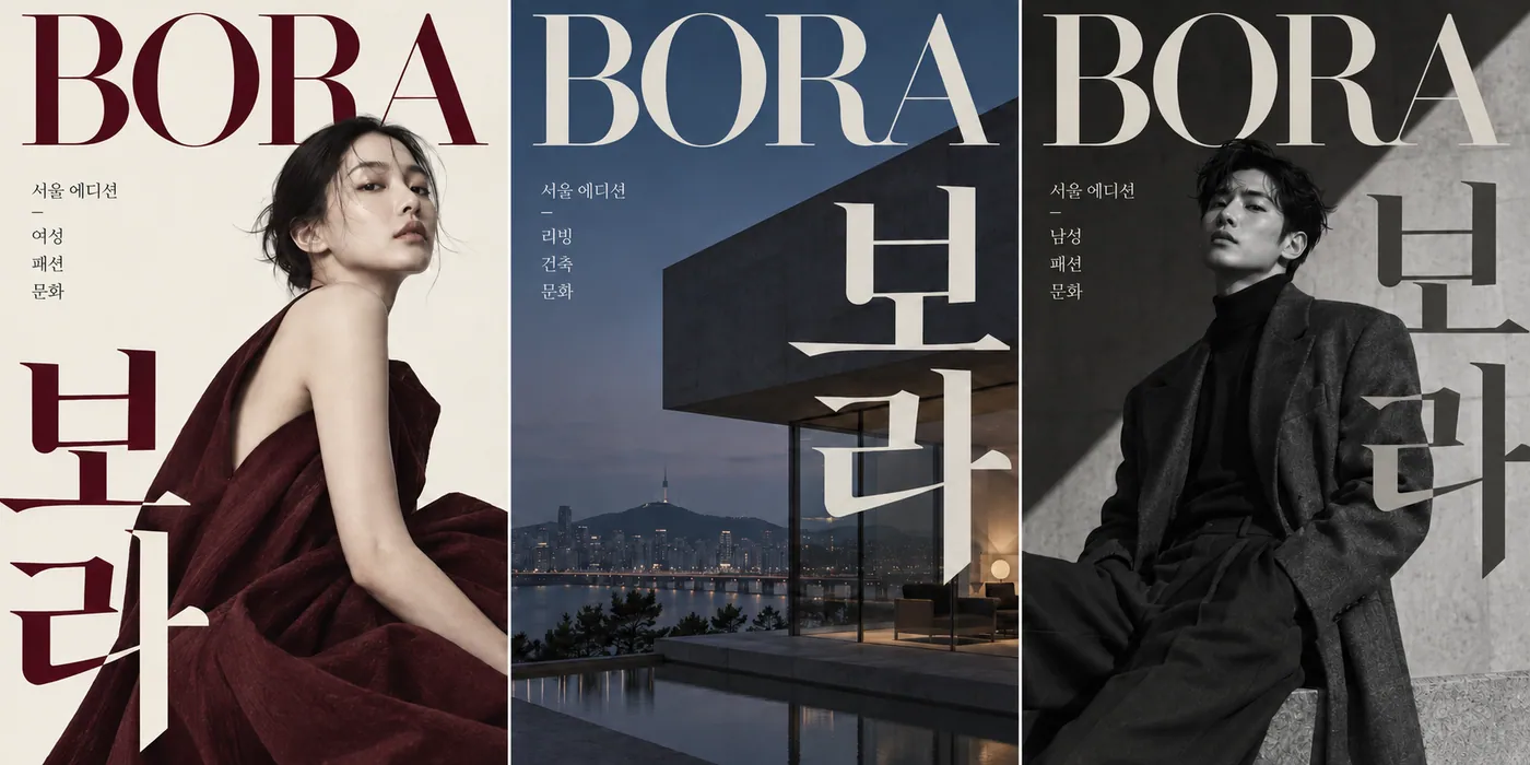
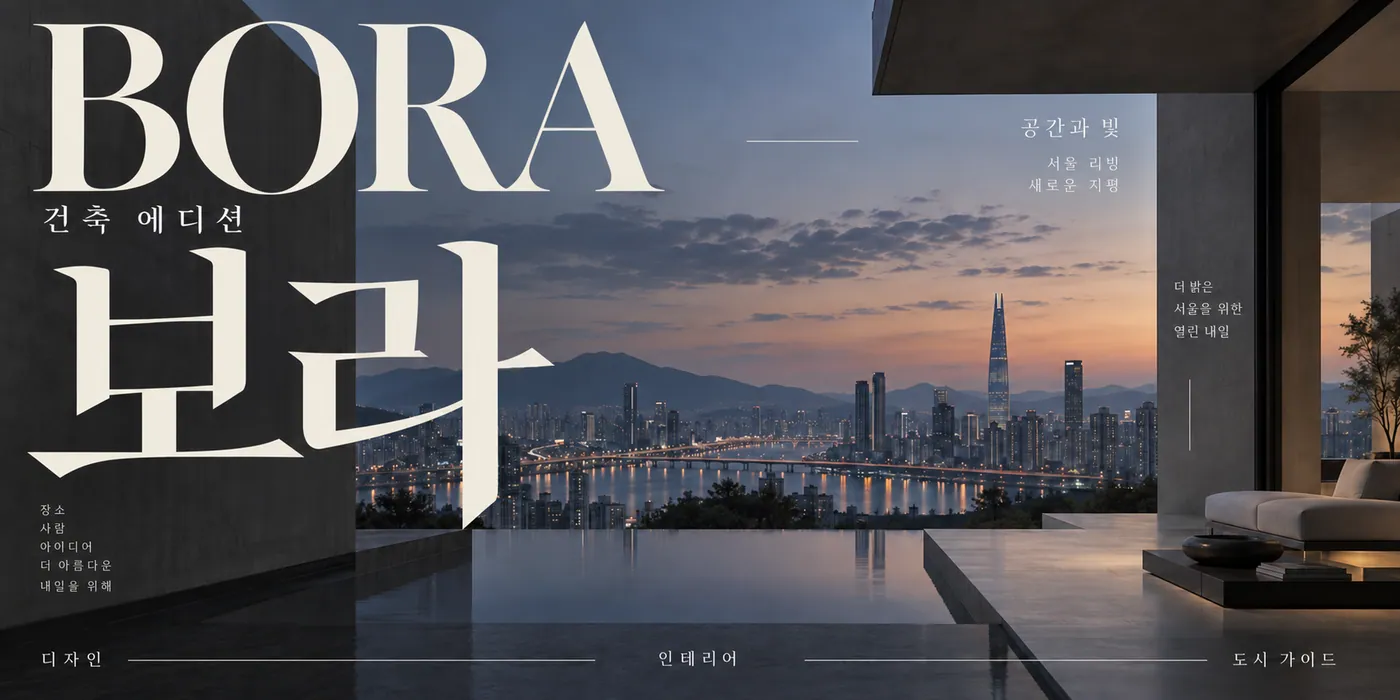
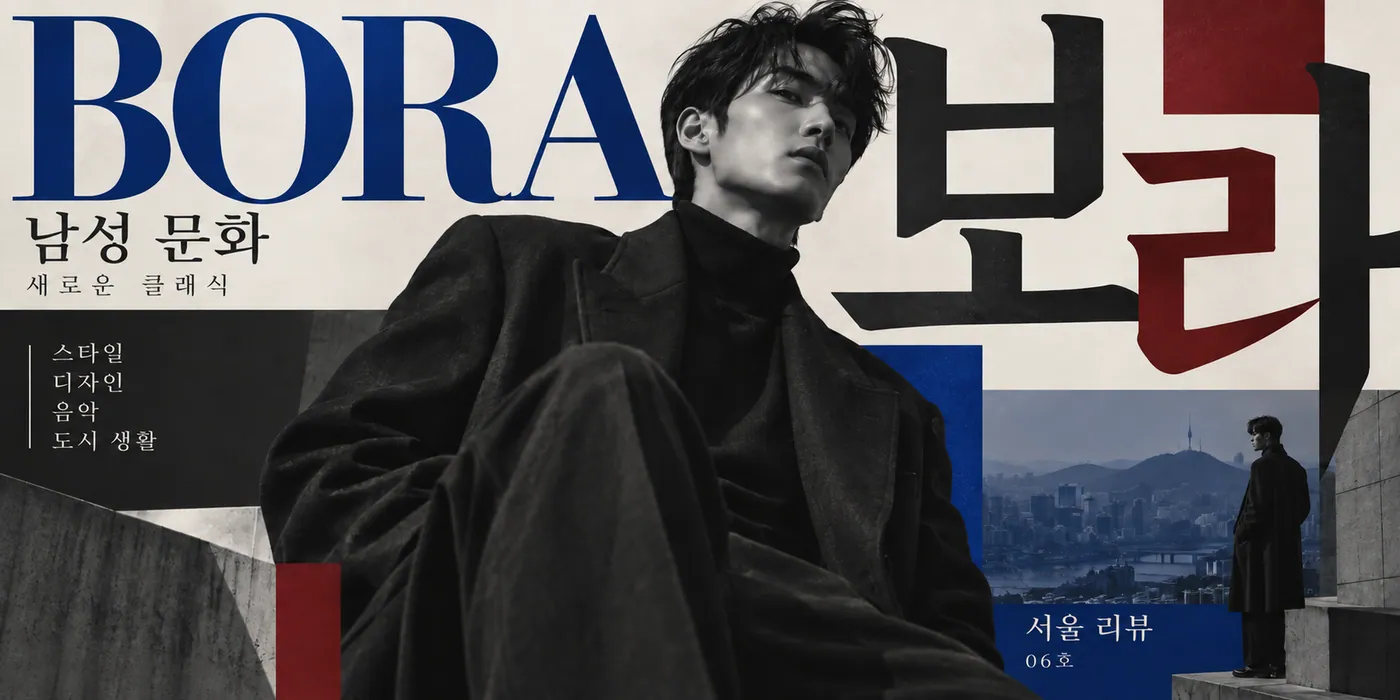
Bora is a gothic (sans serif) family prepared for Korean magazine typography. It unites Latin letters and Hangul characters in one design language, establishing a consistent rhythm across bilingual page layouts.
The family includes seven static weights: Thin, ExtraLight, Light, Regular, Medium, Bold and Black. A variable version covering the 100–900 range is also available.
It suits magazine covers and interiors, architecture and culture publications, brand identities and editorial headlines. The lighter weights work well with generous white space, while the heavier weights carry strong headlines.
MyFonts
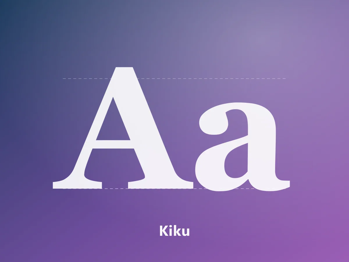
A high-contrast serif family uniting Chinese characters and Latin letterforms in an editorial voice.
 Featured
MyFonts
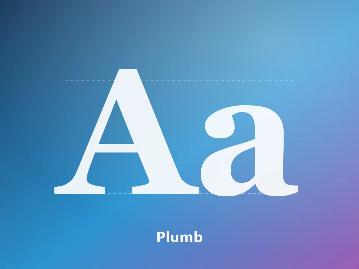
An elegant serif family with editorial character, bringing Japanese and Latin letterforms together.
 Featured
MyFonts
A 28-style contemporary neo-grotesk. A complete typographic system for branding, editorial design and interfaces.